Colors have a unique ability to shape the mood and energy of a home. Whether you’re looking to rejuvenate your living room or give your kitchen a modern touch, the right color palette can make all the difference. For homeowners in Texas, where the vibrant culture and stunning landscapes serve as a constant source of inspiration, choosing the perfect shades is key to creating a space that feels both personal and inviting.
Why Colors Matter
Colors do more than just beautify a room—they set the tone for how the space feels. Warm colors like reds, yellows, and oranges energize and stimulate, making them great for social spaces like living rooms and kitchens. On the other hand, cool hues like blues, greens, and purples create a calm and relaxing atmosphere, perfect for bedrooms and bathrooms.
Your choice of color can also visually transform a space. Light shades make small rooms feel larger and more open, while darker tones can add depth and coziness to expansive areas. With thoughtful planning, colors can help create a harmonious flow throughout your home.
Drawing Inspiration from Texas
Texas homes often reflect the state’s unique charm and diversity. From warm desert tones to coastal blues, there’s no shortage of inspiration. Many homeowners in Texas embrace:
- Earthy Neutrals: Shades like sand, taupe, and beige create a timeless and versatile foundation for any room.
- Vivid Accents: Bold colors like deep turquoise or terracotta add personality and a Southwestern flair.
- Nature-Inspired Greens: Hues like sage and olive bring the outdoors in, reflecting Texas’s lush landscapes.
- Warm Whites: These create a bright, inviting aesthetic and are perfect for reflecting the abundant natural light found in Texas homes.
Tips for Choosing the Right Colors
1. Consider the Purpose of the Room
Each room in your home serves a different function, and the colors you choose should align with that purpose. For instance:
- Living Rooms: Warm neutrals create an inviting space for gatherings.
- Kitchens: Whites and light grays keep the space feeling clean and spacious.
- Bedrooms: Soft blues and greens promote relaxation and restful sleep.
2. Pay Attention to Lighting
Colors can look different depending on the lighting in the room. Test swatches on your walls and observe them at various times of the day under both natural and artificial light. This will help you choose shades that stay true to your vision.
3. Use Color Psychology
Think about the emotions you want to evoke in each space. Yellow can add cheerfulness to a breakfast nook, while navy blue might instill focus and sophistication in a home office.
4. Balance Bold and Neutral
If you’re drawn to bold colors, consider using them as accents rather than the main color. A vibrant red accent wall or navy blue cabinets can make a strong statement without overwhelming the space.
5. Think About the Big Picture
Your home should feel cohesive as you move from room to room. While each space can have its unique personality, ensuring a harmonious flow of colors throughout the house is key.
How to Transform Specific Spaces
Living Areas
Warm neutrals like beige, greige, and taupe create a welcoming environment. To add interest, consider a bold accent wall in a color like rust or deep green.
Kitchens
Kitchens are a great space to play with contrasts. Pair light-colored walls with bold cabinetry in navy or forest green for a modern yet timeless look.
Bedrooms
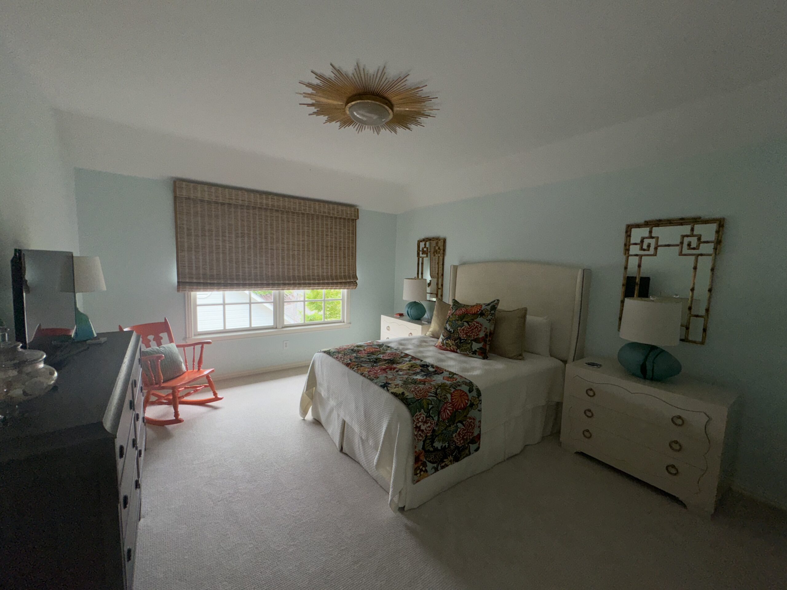
Cool, muted tones like lavender or light gray create a peaceful retreat. For a cozy touch, consider using a darker shade on the wall behind your bed.
Bathrooms
Soft whites and light blues give bathrooms a clean, spa-like feel. For a contemporary twist, add darker tile or trim in a complementary shade.
The Power of Color in Cabinetry
Cabinet painting is an excellent way to refresh your kitchen or bathroom without a full renovation. Opt for neutral tones like white or gray for a classic look, or go bold with navy, emerald, or even black for a dramatic effect. Updated cabinetry can act as a focal point, tying together the entire room’s aesthetic.
Mistakes to Avoid When Choosing Colors
- Ignoring Undertones: A beige with a pink undertone will look very different from one with a green undertone, especially when paired with other colors.
- Overloading Bold Colors: Too many bold shades in one space can feel overwhelming.
- Skipping Test Swatches: Always test colors in your actual space before committing.
Final Thoughts on Transforming Your Space with Color
Color selection is more than a visual choice—it’s an opportunity to reflect your personality and enhance the functionality of your home. In Texas, where the landscapes and culture are so vibrant, you have a wealth of inspiration to draw from. With careful planning and a touch of creativity, the right colors can transform your home into a space that feels uniquely yours.